Hebe — UX Case Study
Turning an outdated ecommerce experience into a digital loyalty hub
- Client
- Hebe
- Role
- Senior Product Designer
- Sector
- Retail / Beauty
- Year
- 2020
Context
Beauty retail mobile commerce experience combining product discovery, checkout and loyalty.
Constraint
The app needed to modernise shopping flows while keeping loyalty central for existing customers.
My move
Led mobile-first commerce concepts, stakeholder alignment, iterative testing and component hand-off.
Outcome
A simplified loyalty-led shopping direction with public signals including a 4.9 App Store rating and 1.3M+ downloads.
/ 01 Problem
Redesign and strategic direction for the Hebe mobile commerce experience — combining ecommerce, loyalty and mobile-first shopping into one product.
- 01
Outdated ecommerce UX with a fragmented customer journey.
- 02
Low mobile convenience and a disconnected loyalty experience.
- 03
Pressure to lift retention without breaking the active member base.
/ 02 Responsibilities
- —Strategy workshops with executives and product stakeholders
- —Benchmarking and ecommerce trend analysis
- —Mobile-first commerce concepts and UI design
- —User testing and rapid validation cycles
/ 03 Approach & process
- 01
Stakeholder workshops to align on scope and KPIs
- 02
Concept ideation across discovery, product, checkout and loyalty
- 03
Iterative testing with members across tiers
- 04
Hand-off to engineering with a living component reference
/ 04 Selected screens
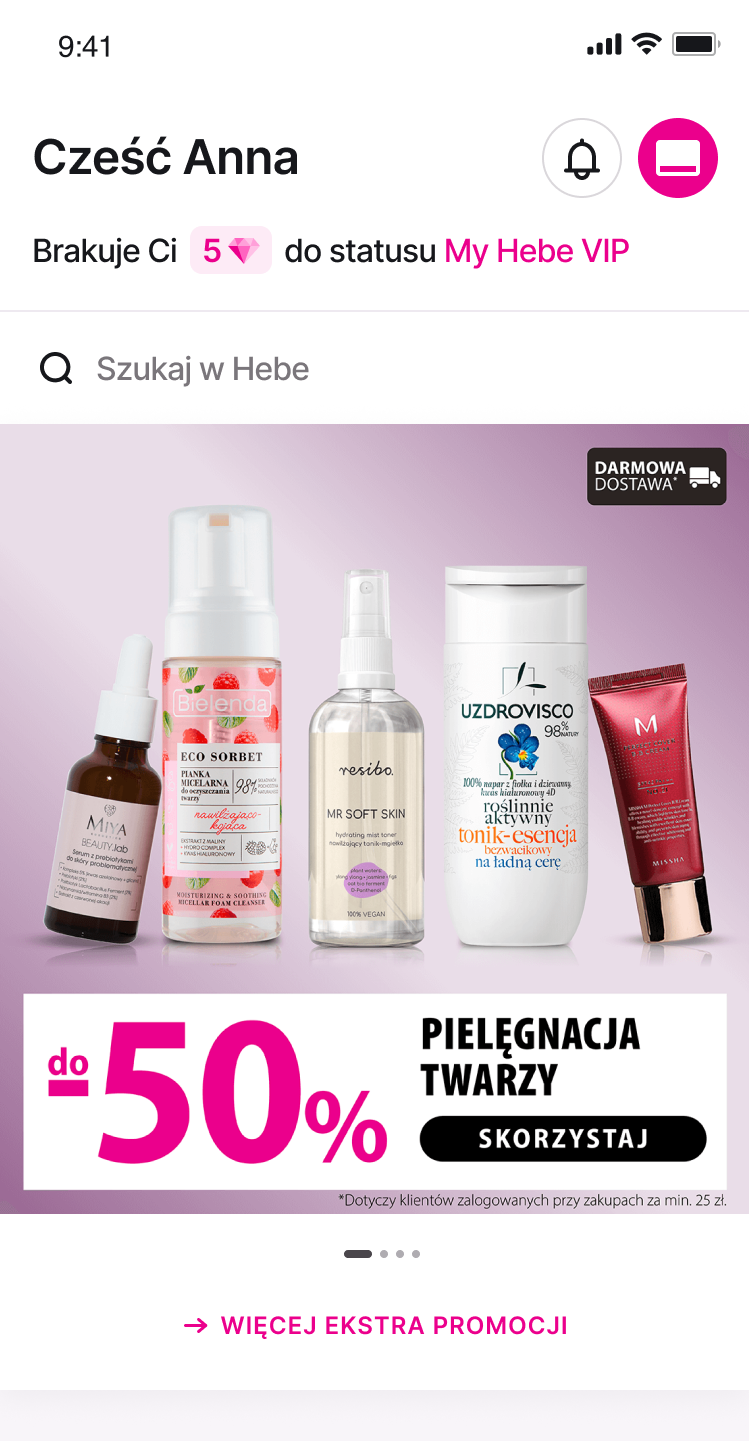
Selected work shown under NDA. Full walk-throughs available on request.
/ 05 Outcome
- →
Simplified shopping experience with loyalty integrated, not bolted on.
- →
Easier product discovery and cleaner checkout flows.
- →
A modern visual direction the brand can keep building on.
- App Store rating
- 4.9
- Downloads
- 1.3M+